


2026
Brand Identity
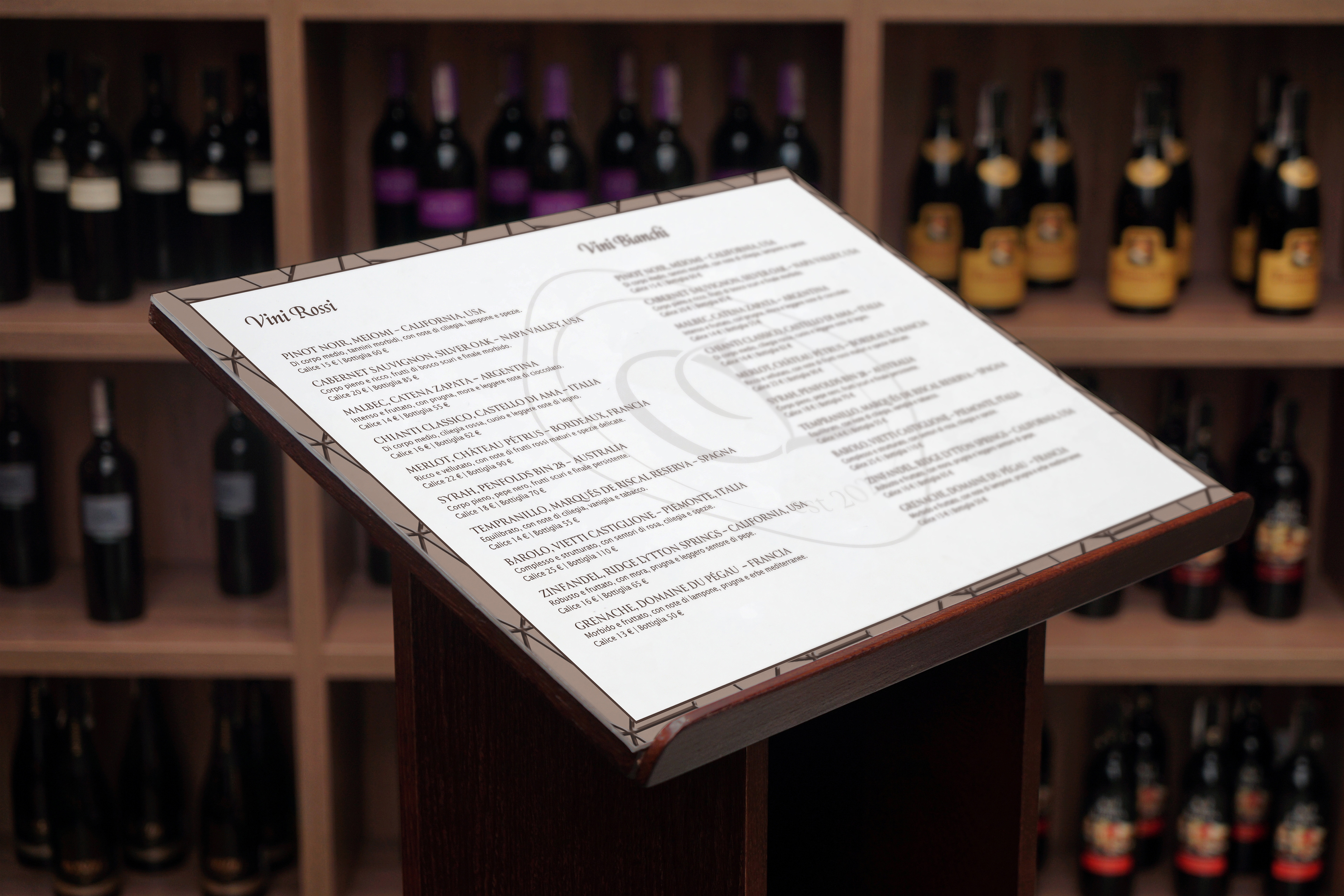
Ombra Lenta is a brand identity designed for a new Italian restaurant rooted in the Veneto tradition. The name comes from the Venetian dialect, where ombra means a glass of wine, turning the concept into an invitation to slow down, savor, and enjoy the moment.
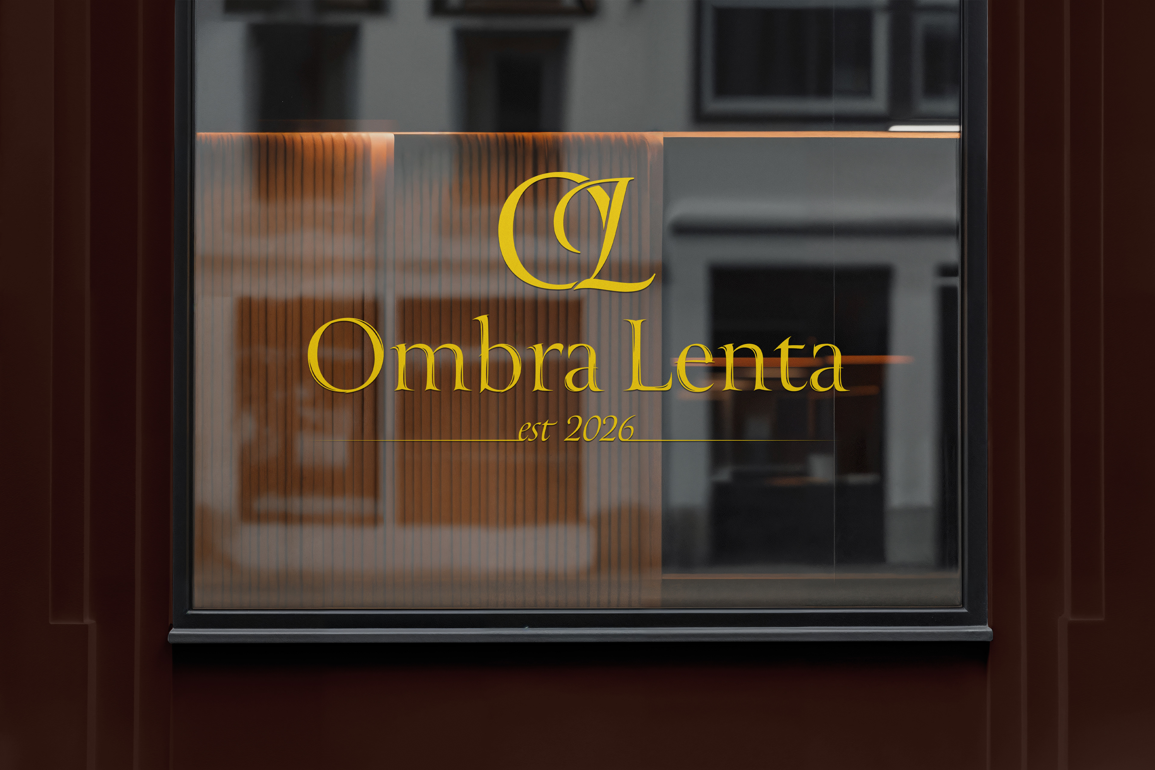
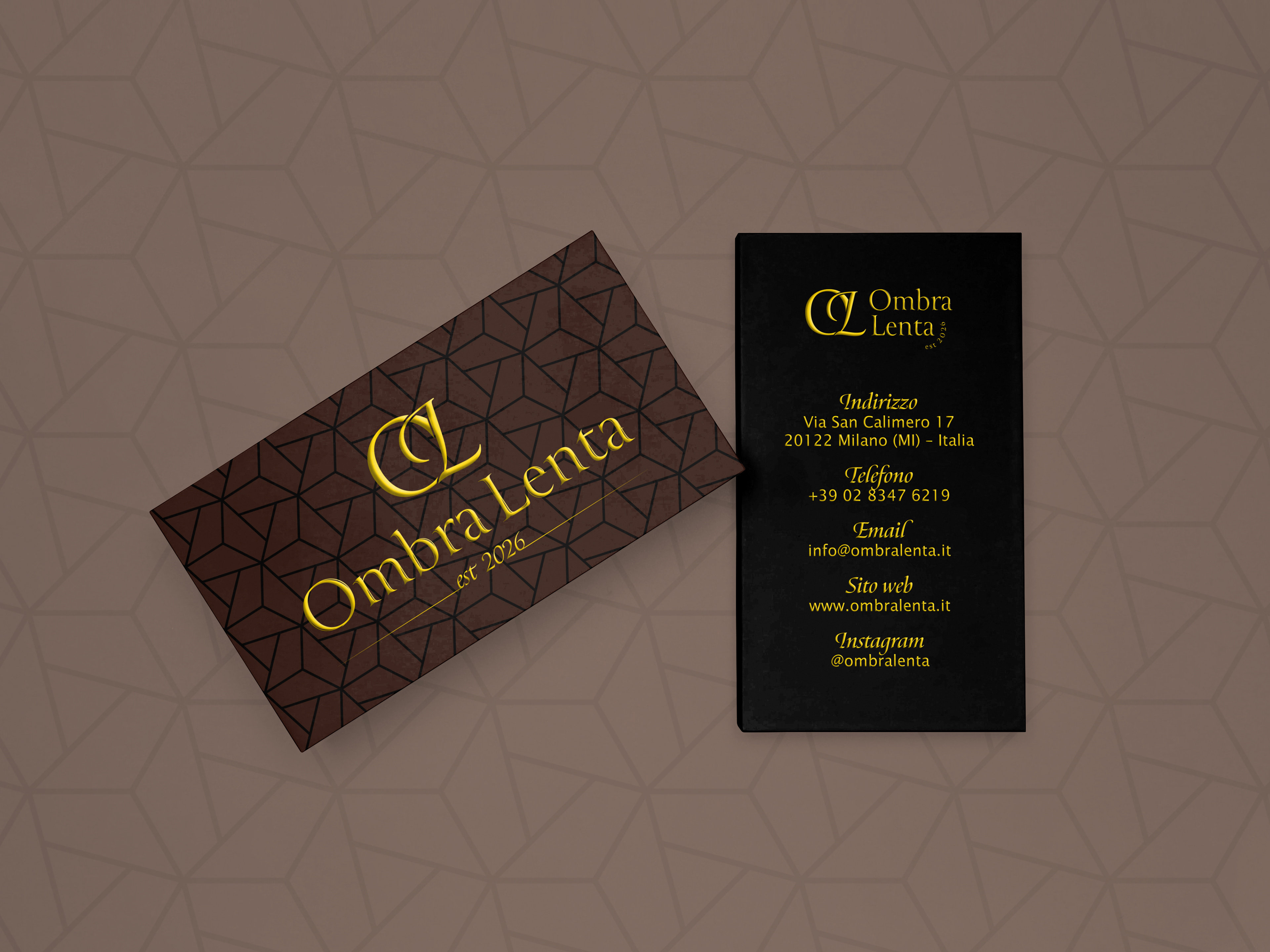
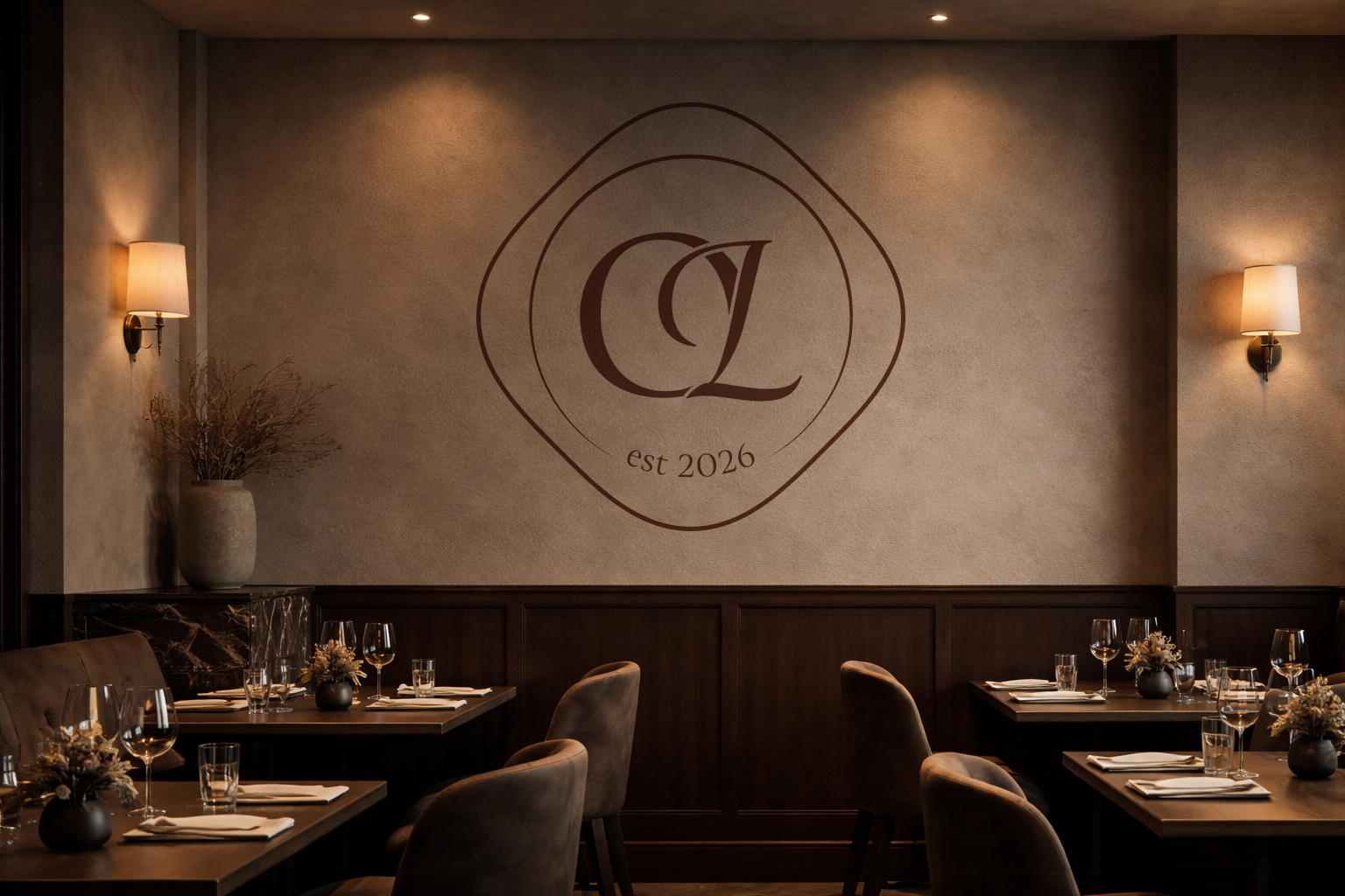
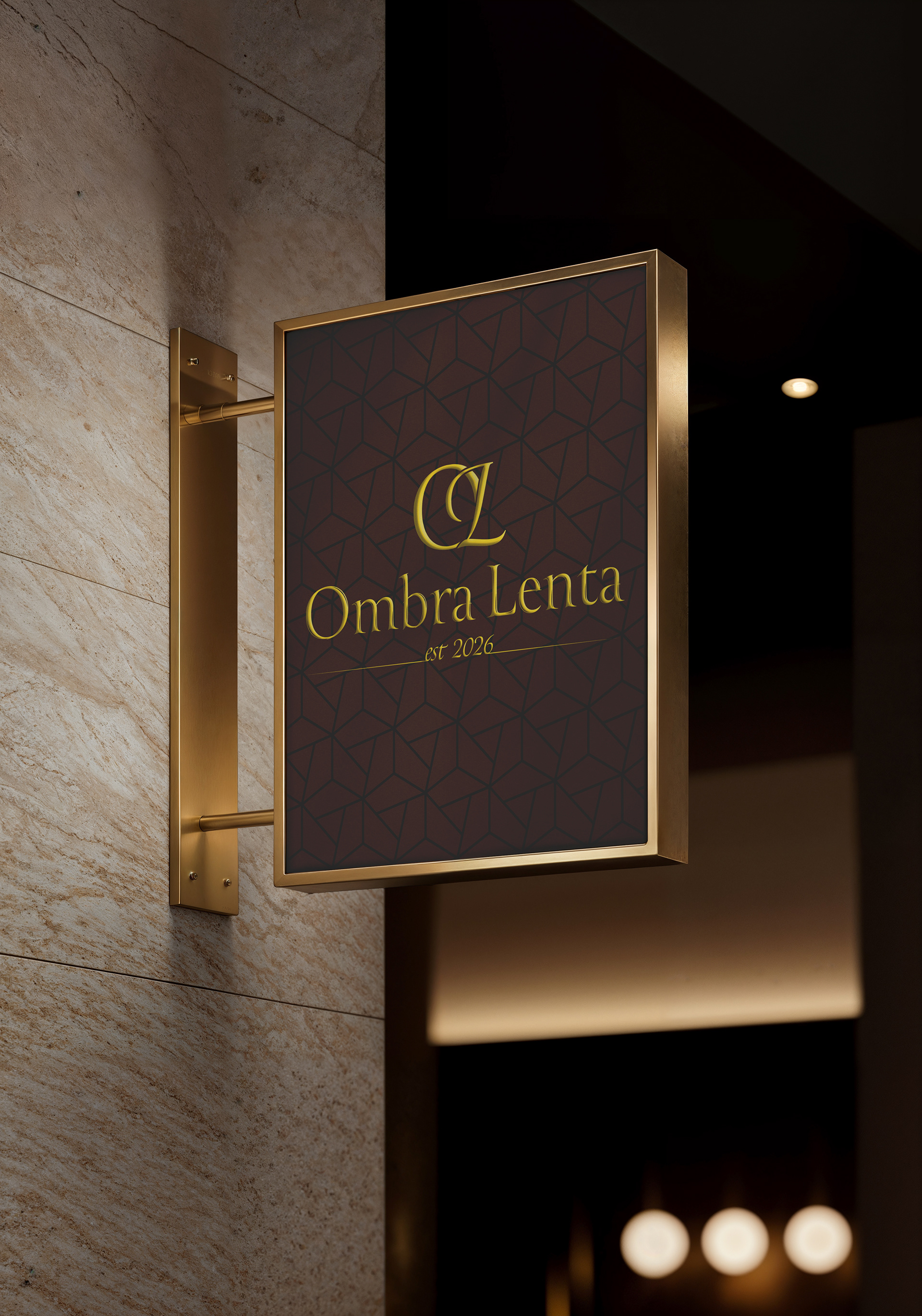
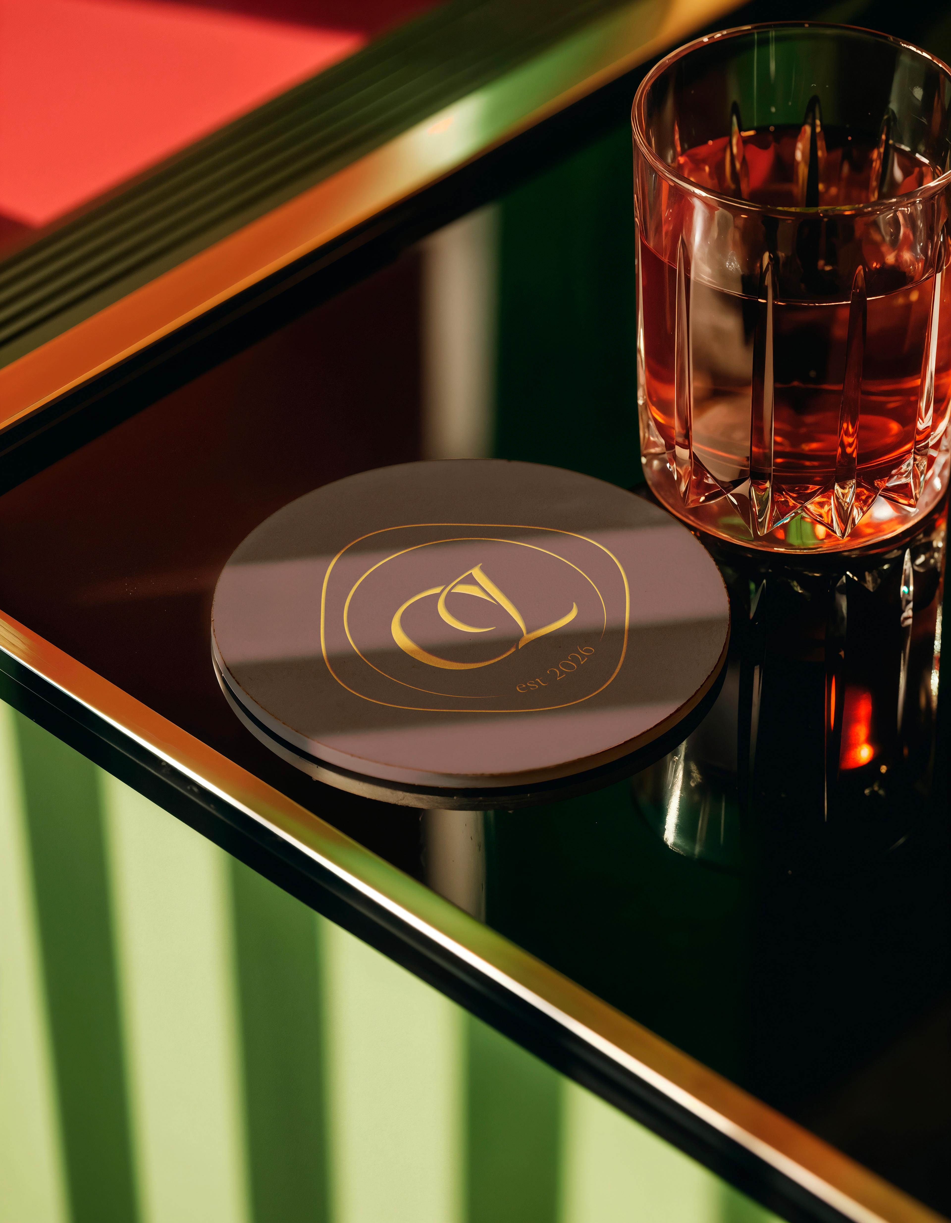
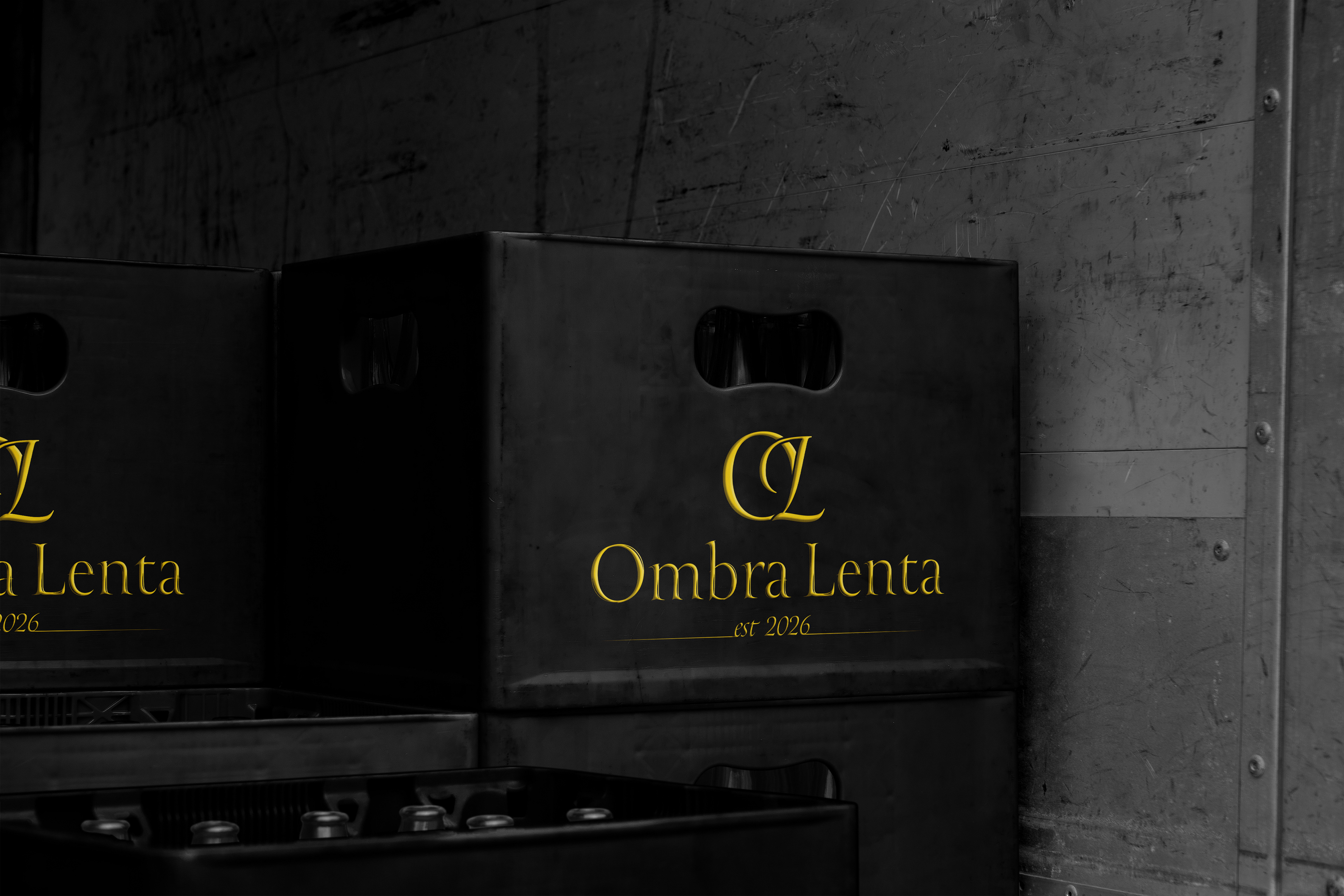
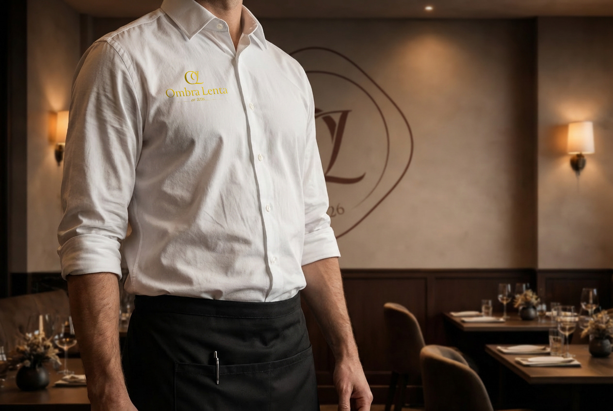
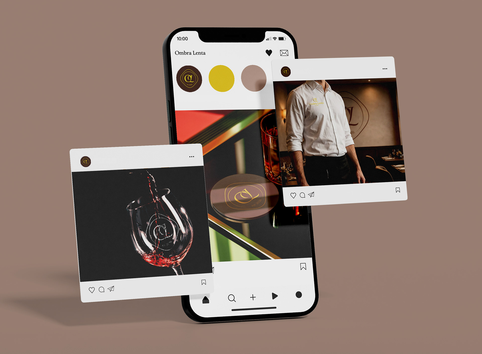
The visual identity blends modern elegance with tradition. The logo is designed to be versatile and is sometimes applied in gold, adding a refined, luminous accent that evokes warmth and quality. The typography system combines contemporary and traditional typefaces, while a warm, understated color palette enhances the sense of calm and sophistication. Together, these elements create a timeless atmosphere that reflects the pleasure of unhurried dining.


Primary Logo, Secondary Logo, Logomark
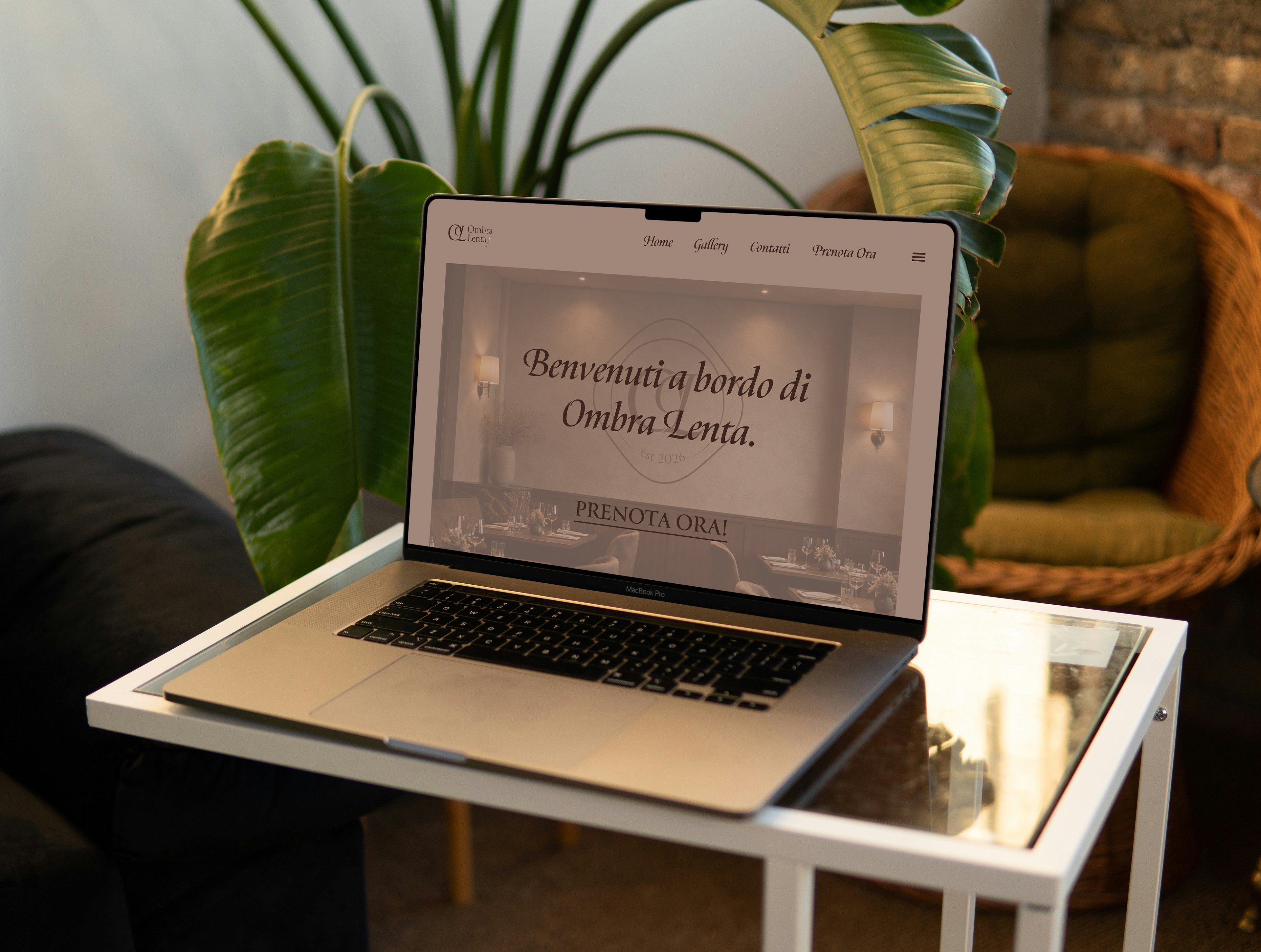
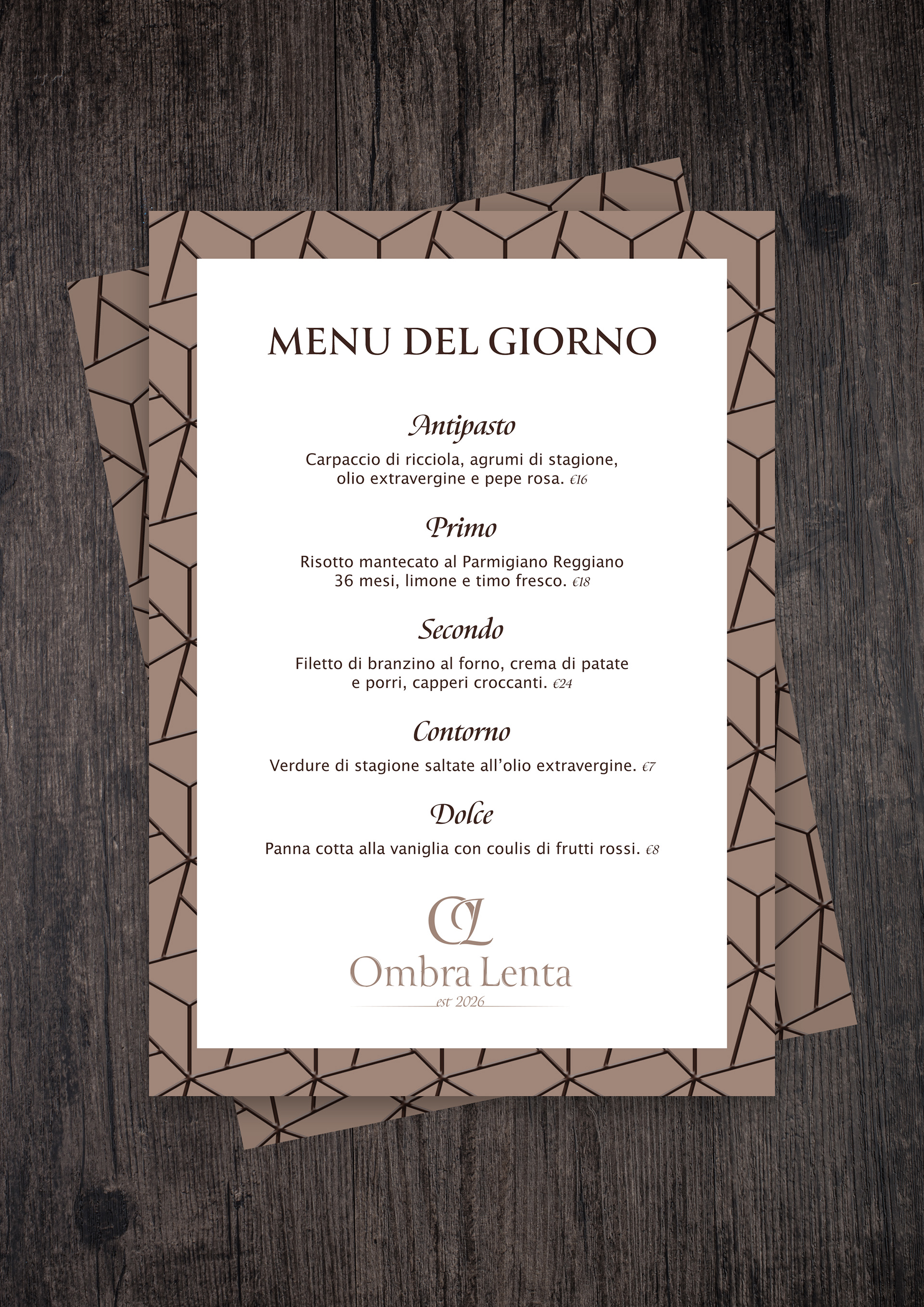

Fonts
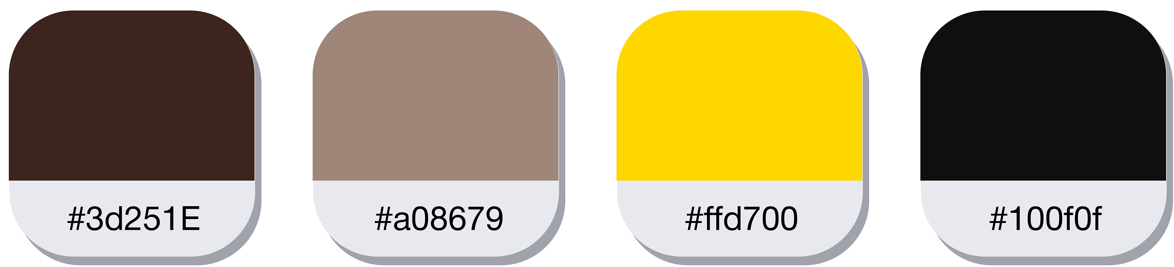
Colour Palette